Content Fields & Sections
How a section is built, what the field-name prefixes do, and how to keep every page editable by someone who has never seen the plugin.
A section is four things
| Part | Holds | Who edits it |
|---|---|---|
template_html |
Markup with {{placeholder}} markers |
AI, or you in Advanced Mode |
content_fields |
The actual words, images, links, icons | Anyone, in Content Mode |
scoped_css |
CSS scoped to this section | AI, or you |
section_js |
Optional JS, in an IIFE with section pre-bound |
AI, or you |
The split is the point. Changing the design needs the AI. Changing the content never does.
<!-- template_html -->
<section class="hero">
  <h1>{{title}}</h1>
  <p>{{html_subhead}}</p>
  <img src="{{image_hero}}" alt="{{image_hero_alt}}" loading="lazy" />
  <a class="hero__cta" href="{{cta_url}}">{{cta_label}}</a>
</section>
{
  "title": "Care that starts with listening",
  "html_subhead": "Same-day appointments, <strong>no waiting room</strong>.",
  "image_hero": "https://example.com/wp-content/uploads/hero.jpg",
  "image_hero_alt": "Dentist talking with a patient",
  "cta_url": "/book/",
  "cta_label": "Book a visit"
}
Field name prefixes
The prefix decides how the value is treated on render and which input Content Mode shows.
| Prefix | Behaviour |
|---|---|
| (none) | Plain text, HTML-escaped. A plain field holding markup such as <strong> prints the tags as text, and validate_page warns about it. Use html_. |
html_ |
Safe HTML allowed — bold, links, lists |
image_ |
Media picker. Always add a companion *_alt field |
responsive_ |
A full <picture> element with sizes and formats. In the section editor a responsive image shows as a read-only row. Change it in Advanced mode or through MCP. |
icon_ |
Phosphor icon picker. Value is a kebab-case icon name |
shortcode_ |
Run through do_shortcode() on render |
Icons, specifically
Put the placeholder directly inside its container. The renderer replaces it with a complete
<span class="ppd-icon">…<svg>…</span>.
<div class="card__icon">{{icon_feature1}}</div>   <!-- right -->
<span data-icon="{{icon_feature1}}"></span>       <!-- wrong: SVG inside an attribute -->
For an icon that shouldn't be editable, hardcode it: <span class="ppd-icon" data-icon="shield-check"
data-icon-style="fill"></span>.
Icons inherit currentColor and are sized with CSS on the .ppd-icon span. 104 ship with the plugin;
1,500+ more are fetched on demand. Never use emoji.
Site-level placeholders
These resolve at render time and need no content field:
{{site_name}} · {{site_url}} · {{site_tagline}} · {{current_year}} · {{wp_menu:location}} ·
{{business:name}} · {{business:phone}} · {{business:email}} · {{business:address}} · {{business:hours}} · {{business:social:*}}
Template placeholders — {{post_*}}, {{archive_*}}, {{term_*}}, {{search_query}}, {{paged_*}},
{{loop_wc_*}}, {{main_query}} — are covered in
Template System.
Navigation that knows where it is
{{is_current:/features/}} in a link's class highlights it on that page (it prints is-active there and nothing anywhere else). {{is_current:/product/*}} keeps a parent item lit across a whole branch. Menus printed with {{wp_menu:location}} already carry WordPress's own current-item classes, so this is for hand-built navigation.
Content Mode field types
Attach a content_fields_schema and Content Mode renders a proper labelled form instead of bare text boxes.
Per field you can set label, description, type, placeholder, options, required and group.
Available types: text, textarea, wysiwyg, url, image, icon, number, select, color.
url: a link. Accepts a full address (https://…), a path on this site (/our-services/), an in-page anchor (#contact), ?query, mailto:, tel: and placeholders. If a link cannot work as written (for example www.example.com with no https://), the editor opens that field, says what is wrong, and will not save the page until it is fixed. AI tools get the same warning (invalid_url) when they write it.
Give fields a group in the schema and Content Mode shows them as collapsible blocks. That helps with a mega menu or a large card grid with dozens of fields.
This is UI metadata only — it never changes what renders. Always provide it on any page you hand to someone else.
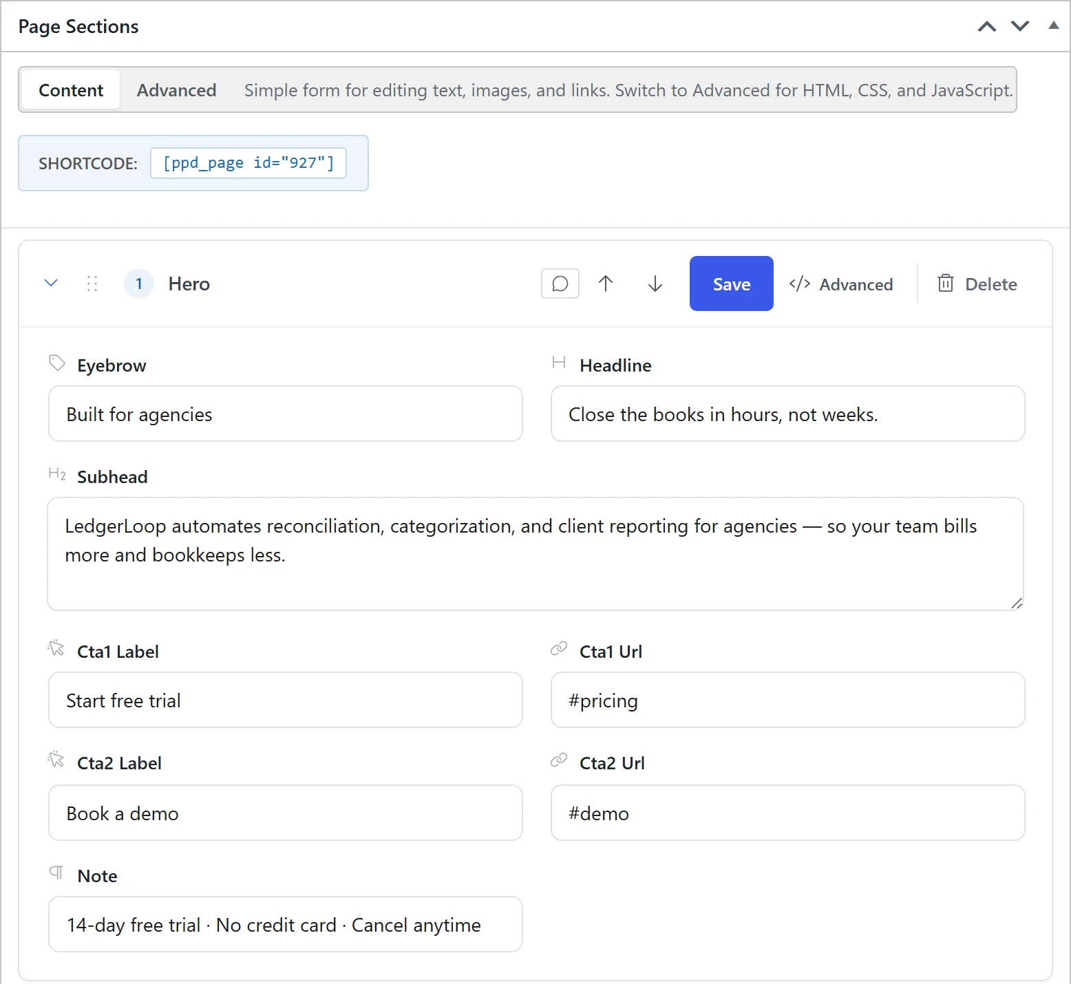 Hover to pause · click for full size
Keeping pages editable
This is the single most important habit, and the plugin enforces it:
When the AI saves a section that is mostly hardcoded text with few or no editable fields, the plugin warns it during the write that Content Mode users won't be able to edit it.
If a section slipped through anyway, its editor shows a notice explaining that its content is hardcoded and
pointing at the code editor. The fix is always the same: pull the copy out of template_html and into
content_fields.
Already have a page full of hardcoded copy? extract_content_fields pulls it out into labelled fields in one step. It shows a preview first, saves a version so it can be undone, and skips anything already done. Text that contains bold or italic becomes a rich-text field.
Rule of thumb: if a human might ever want to change it, it belongs in a content field.
Repeating items and optional parts
A list of cards, steps or reviews doesn't need its items spelled out one by one in the markup. A repeat block renders its body once per numbered set of fields:
{{repeat:s}}<a href='{{s#_url}}'>{{s#_title}}</a>{{/repeat}}
That prints one link for s1_url / s1_title, one for s2_url / s2_title, and so on. To add or remove an item, add or empty its fields. The section editor has an Add item button for this.
An if block drops an element whose field is empty, so an unused eyebrow or second button leaves no empty box behind. {{else}} is optional:
{{if:eyebrow}}<p class='eyebrow'>{{eyebrow}}</p>{{/if}}
Section anchors
patch_section(anchor: "watch") gives a section a stable #watch link that doesn't change when sections move.
Finding an icon
list_icons(search: "…") searches every Phosphor icon, not just the ones that ship with the plugin.
Styling
- Use design tokens —
var(--ppd-colors-primary),var(--ppd-spacing-section-y)and so on. Set them once at Design Pages → Design Tokens. - Never declare
--ppd-*variables in page CSS. Tokens are owned by the token system and rendered fresh on every load; declarations in page CSS are stripped on save and on render so a stale hex can't shadow a live token. - Give every section a uniquely-classed wrapper.
- Section CSS is scoped and minified.
calc(),clamp(),min(),max()andvar()survive minification intact.
Token groups
Besides colours, fonts, spacing and shape, the tokens cover:
type: heading weight, case and tracking, body size, line height, and the eyebrow label style (size, weight, case, tracking).button: padding, weight, case and tracking.shapeper component:radius-button,radius-card,radius-input,radius-image, plusborder-widthandshadow-sm.- Colours
on-primary(text on a primary background),surfaceandtext-muted.
Every change to the design tokens is recorded. get_design_token_history lists earlier sets and restore_design_tokens puts one back.
Site components (nad-*)
Some pieces repeat across a whole site: a button style, a badge, a small script. Define one once as a site component and use it anywhere by adding its class, for example nad-btn ("nad" stands for NoLeemits AI Design).
- Its CSS and JS load only on pages whose markup uses the class. That includes sections embedded in another builder with
[ppd_section]. - Every rule must include the component's own class, so a component can never restyle your theme. Page and section CSS still override it.
- The last five versions are kept, and exported pages carry the components they use.
For AI: list_site_components, get_site_component, set_site_component, delete_site_component.
Section JavaScript
Use section_js, not a <script> tag in the markup. It runs in an IIFE with section pre-bound:
var btn = section.querySelector('.hero__cta');
Declare libraries in js_dependencies — gsap, scrolltrigger, aos, alpinejs, swiper, splide,
plyr, countup, typed, lottie — or pass a full CDN URL. They load only on pages that ask for them.
Prefer CSS. And never use IntersectionObserver on an above-the-fold section — elements already in the
viewport on load may never fire the observer and stay stuck at opacity: 0. Use setTimeout for hero entrances.
Reusing sections
- Section Library — save a section once, insert it into many pages. Edit the library item and every page using it updates. Per-page overrides are available. Library previews snapshot the source page's CSS so they render faithfully.
- Global sections — header and footer, injected on every page, with per-page overrides and an on/off switch. Replacing the global header or footer changes every page at once, so run
set_global_sectionswithdry_run=truefirst: it writes nothing and shows how many pages the change reaches. The last 15 versions of each are kept, andlist_design_changes/restore_design_changeput an earlier one back.